20
variations of illustrated brand mascot
Tile Monkey is a brand new, independent start up tiling business. The guys behind the brand are well versed in eCommerce but they required a great brand concept to go with their website. We discussed logos and brand characters and settled on a full branding project, from typography and colour palette, logo and character illustration, to design for print work.

The bright colour palette mirrors the relaxed and happy ethos Tile Monkey wanted to achieve. Monkeys love fruit, so we named each colour after one – plum, grape, peach, and banana – which kept the colours fun and memorable.

We settled on a round and friendly Asap Bold to compliment the equally round and friendly figure of the monkey character, making sure it didn’t look childish. We combined this with Source Sans Pro for the body copy, which kept a good balance between quirky and neutral typography.
We designed three different logo versions to complement various contexts and spaces available, with either stacked or horizontal type. The brand mark features a monkey’s face, cleverly incorporating letters T and M.
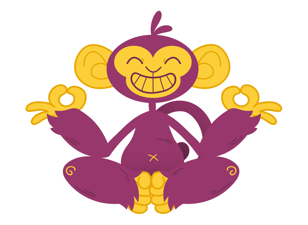
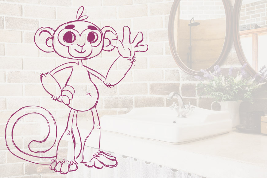
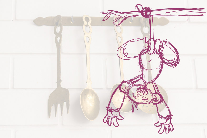
The round shape and body proportions of the Tile Monkey character were inspired by the old Disney style, with large head, belly, hands, and feet, and thin limbs. We illustrated the monkey with a vector brush to ensure the lines were organic and had a natural flow to them. There are four bodies and five faces that can be mixed and matched together to create various poses.

Tile Monkey needed designs for print to match their new branding. We designed business cards, an envelope for sample products, and an A5 promotional flyer. All feature the monkey brand character and use the main brand colours – grape and banana.